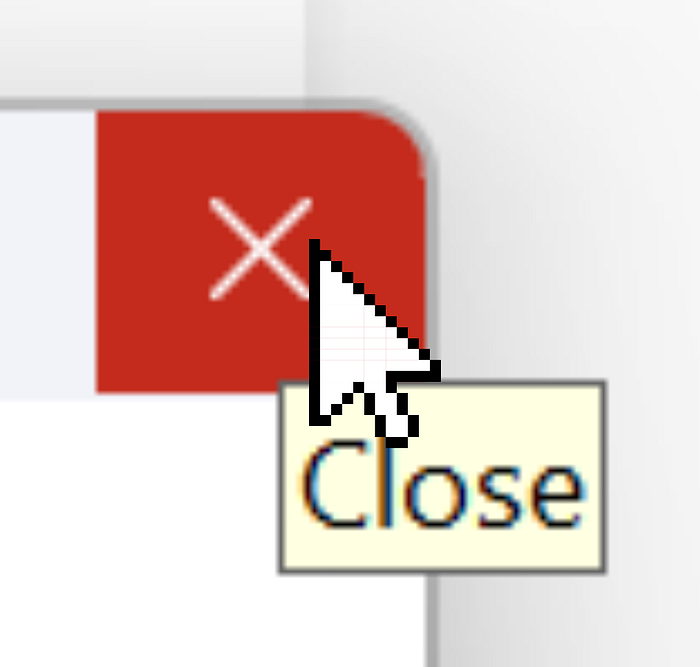
Hover is over
This is my UI design advice inspired from “Eval is evil.” Stop relying on hover for revealing hidden actions, or providing essential information. Hover’s distracting, clunky, undiscoverable, inaccessible, and frustrating.
Distracting
When you reveal a certain part of your UI layout using hover, unhovering would hide the same UI. That might easily turn into a a flicker on the UI where the user’s scrolling or just moving the mouse pointer around. Remember the web page ads that popped up when you only hovered on a word? Remember those feelings? That feeling is exactly what made Anakin Skywalker turn to the dark side.
Clunky
To avoid the problem with distraction, UI designers add delays, so the hidden part is only revealed when you wait long enough on the certain region of the interface. That solves the distraction problem, but now you have a clunky UI that makes you wait much longer. Every time you have to use the same UI, you’re charged a non-distracting UI fee from your time.
Undiscoverable
There’s no universal UI language that says “this item can be hovered, and will do this if you do so.” You only accidentally discover a hoverable UI, or you hover over every UI element like the old LucasArts adventure games where you had to find the right pixel to pick up the right item to solve the puzzle. I loved those games but not the pixel finding parts.
Inaccessible
In addition to being undiscoverable, which is also an accessibility issue in itself, hover-based UI designs require mouse finesse. You must avoid moving the mouse too much or you might lose the hover. People have developed numerous techniques to prevent you from losing your hover status on a drop down menu item.
You have to be able to target a certain area with mouse without accidentally click on it either. I’m sure operating systems provide certain fallback mechanisms to alleviate some of these issues, hover isn’t accessible by default. It’s hard to use.
Some screen readers might use hover text information and present it in a meaningful way, but there are other, better suited ways for that like ARIA labels without relying over the hover itself.
Frustrating
Hover state can easily get lost by accidentally moving the mouse and that can cause the user to click on something else instead unintentionally. Similarly, losing hover would make you wait another second to see the UI again. It’s all prone to mistakes, accidents, tears, and screams.
Besides, mobile devices can’t support hover because we haven’t invented such screen sensors yet. Mobile web browsers treat clicks as hovers. That means when you click an element that shows a different style when hovered, you’ll have to click on it once again, because your first click would only register as hover. Arguably, any sane designer would add conditionals to avoid such behavior on mobile, but that means there’s a disconnect between the UX provided by platforms which is an issue in itself. Users will have to learn different ways of using your app regardless how subtle the differences are, which is also frustrating.
The hoverless way
Just integrate the revealed portion of the interface into the main UI, or under a clickable action. You might think that it’s an extra step for UI interaction, but it’s actually faster than waiting for menu to appear.
When is it acceptable to use hover?
Ideally, never use hover. If you have to, use hover only to amplify the quality of the user’s experience, and never as the core of your user interaction flow. Your UI should be perfectly usable and accessible without hover.
P.S. If you like my content, I have a book about programming tips; check out Street Coder.
